Project Overview
The Problem:
Going out in large groups to eat out can sometimes be a hassle. This experience can commonly have some hurdles ranging from gathering everyone on a timely matter at the restaurant, waiting on the bill to arrive or even splitting the check properly. Once the bill is ready to be paid there is usually an unfair bill split amongst the party wether it be someone either underpaying or overpaying a part of the bill.
The Solution:
Partnering with restaurants, Plan Check helps overcome the hassles of the group dining out experience by making it easy to reserve a table for a group to accurately splitting the bill.
My Role:
User Research, User Interviews, Persona Creation, User Journey, Information Architecture, User App Flow, Wireframes, and
User Testing
TOOLS:
Adobe Illustrator CC (Wireframes), Axure (Prototype)
Team:
Jose Caldera, Jasmine Pae, Kristian Tumangan
Discovery
User Interviews
Before even diving into the features and the overall UX of our product we conducted some user interviews.
Some of our interviews included friends to restaurant servers to gain a better understanding of the problem. These are some the key take aways from those interviews:
Key Insights
1. Organizing for big parties is both stressful to the planner and the restaurant side. (i.e. waitstaff, managers, etc.)
2. Service is always key to customers. When going out to a restaurant
customers have certain expectations on the service they recieve.
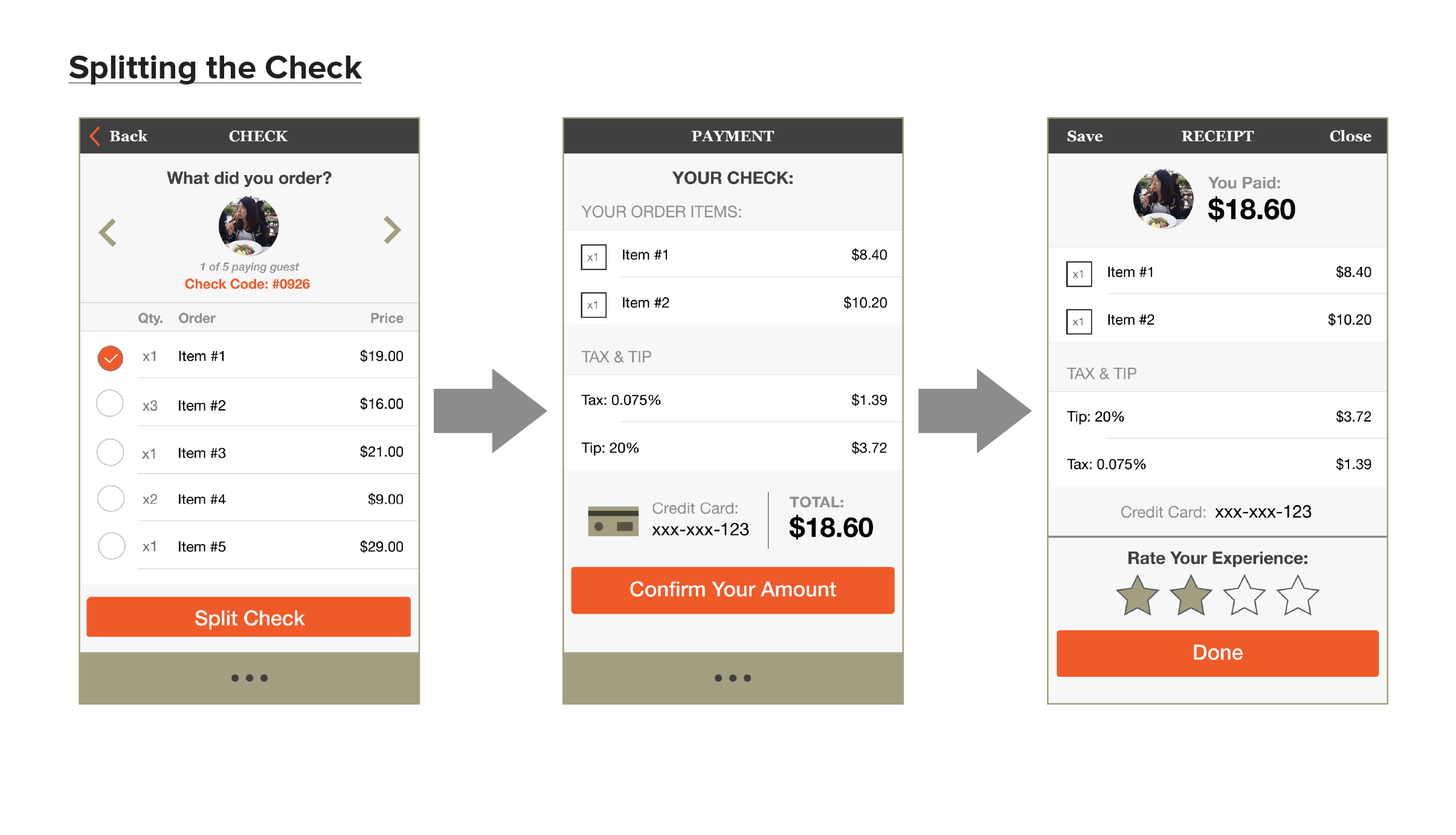
3. Splitting the bill amongst a big group can be stressful for a dinner party, and can even cause a wait time with servers finalize payments. As for the restaurant time equals money, and the faster they can process payments the faster they can sit more people.
Key Experience Principles
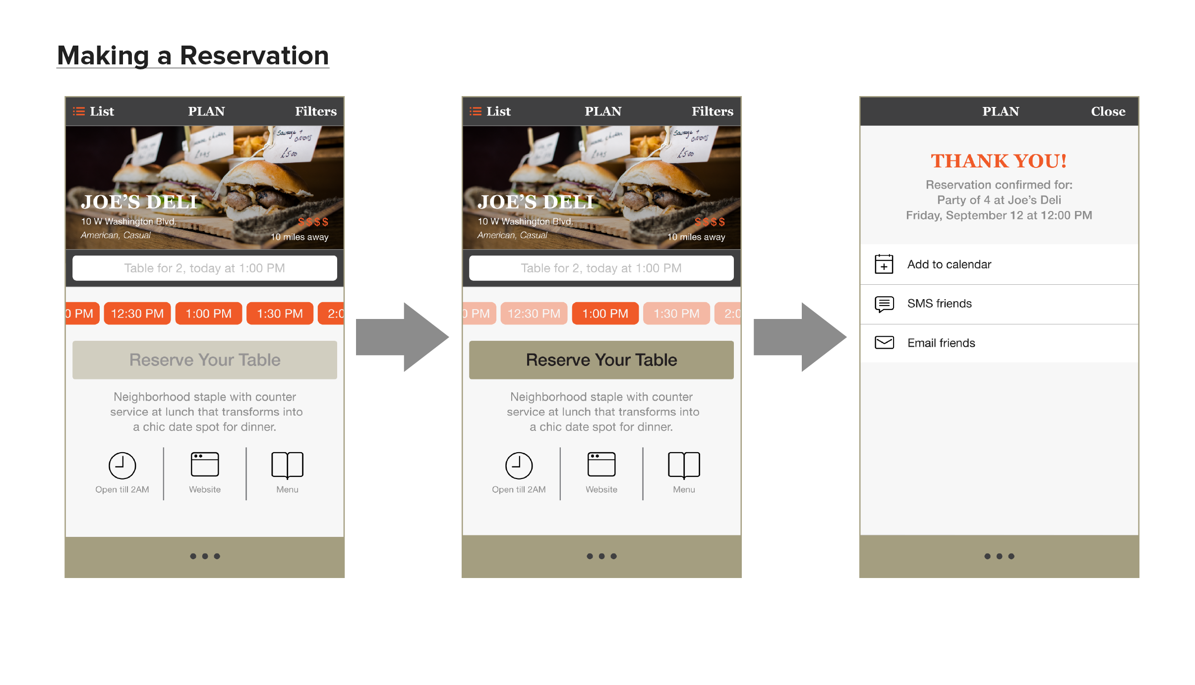
1. Reservations: Allowing to make reservations beforehand not only helps both parties, the customer and restaurant, plan more efficiently, but makes for better communication on both sides.
2. Automation: Automate any part of the dining process whenever it is possible (i.e. delivering the bill, printing the check, etc.). This then frees up the server to provide better service. (This will be accomplished through POS integration)
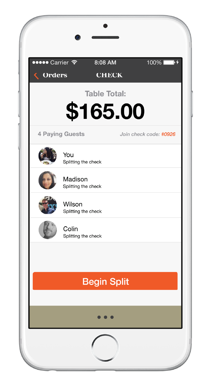
3. Accuracy: Allowing for the bill to be split in different ways that accommodate to the customer’s needs (Dutch, Even Split, Cover for someone). All the while making sure that the bill is covered accurately, fairly and easily.
Persona
Based on the research found in the discovery period of the project a persona was developed, Alyssa. Designing for Alyssa helped in making informed design decisions as we had the end user always in mind.
User Journey
Keeping Alyssa in mind, we mapped her user behavioral flow from planning to splitting a meal with a large group. Understanding her decision making and flow within the group dining experience allowed us to brainstorm the necessary features and opportunities required for Alyssa to successfully navigate through the app.
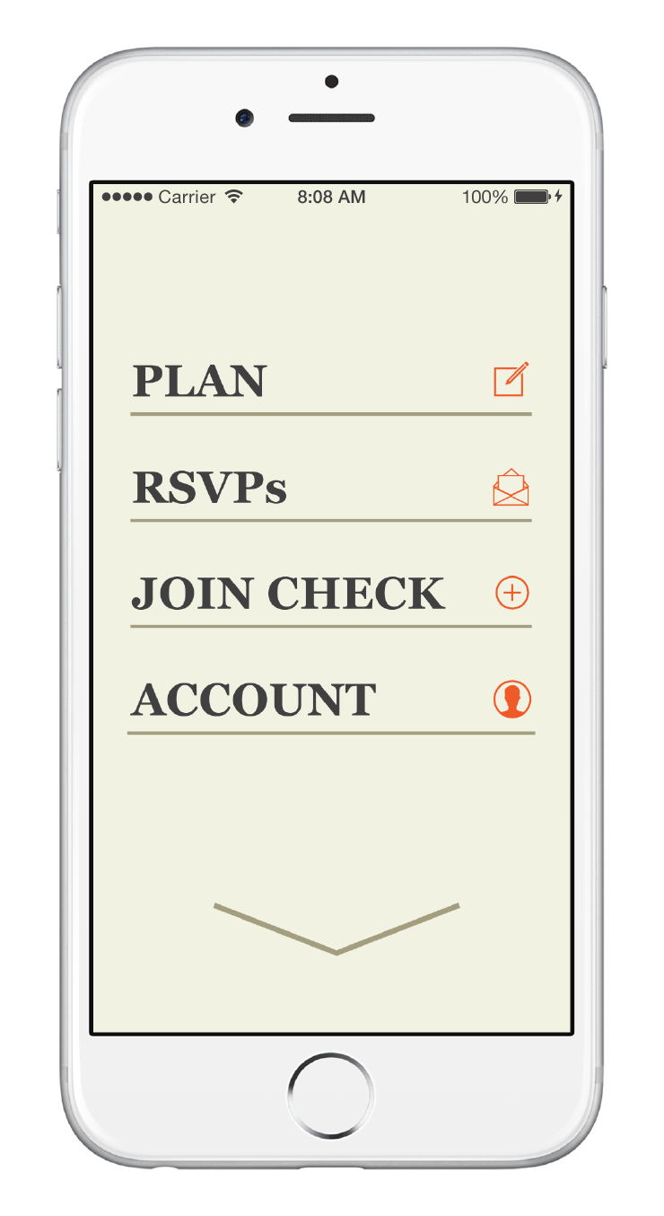
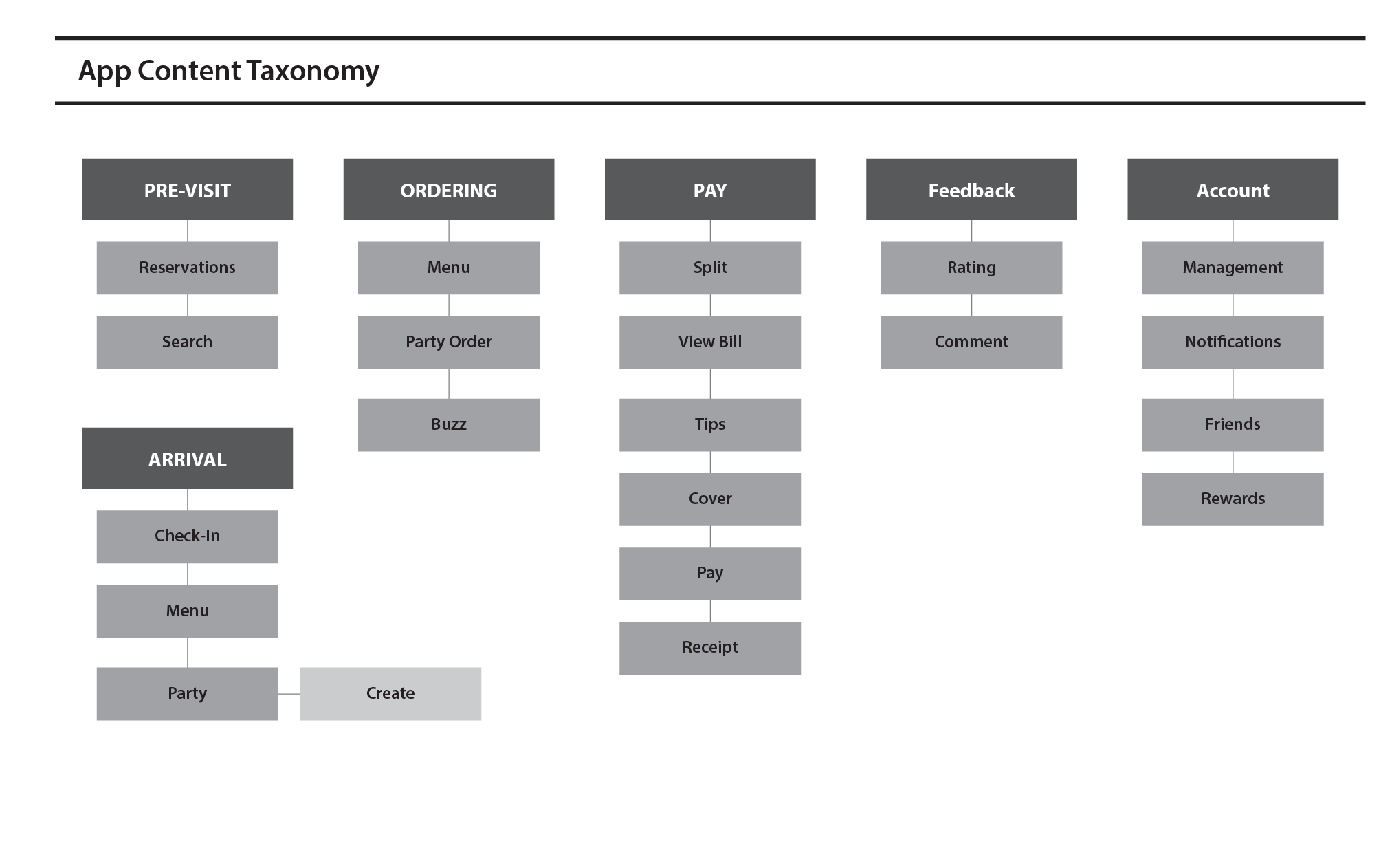
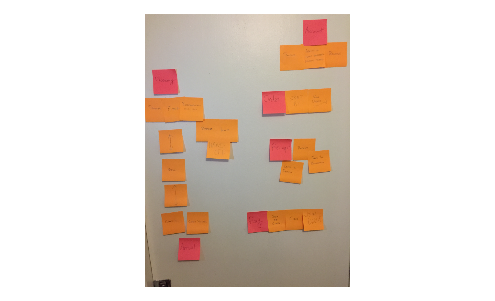
Information Architecture
By analyzing Alyssa’s group dining journey we were then able to narrow down the features via card sorting for the necessary features for Plan Check to function. We then created a content taxonomy map, to give meaning to the defined features, and a site map to organize the pages, information, and navigation of the app.
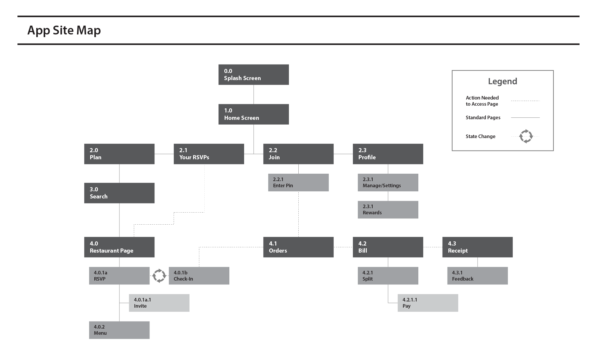
We also created a user flow for the key tasks within the app: checking in to a reservation, and splitting/paying for the bill. By going through the flow of the key tasks it helped us think through the core activities and ensure a seamless process from all perspectives (planner, guests, restaurant) in the dining out experience.
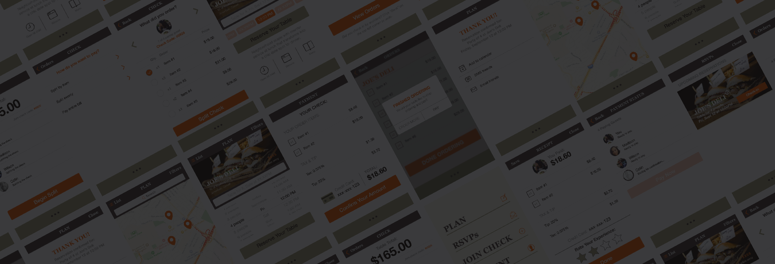
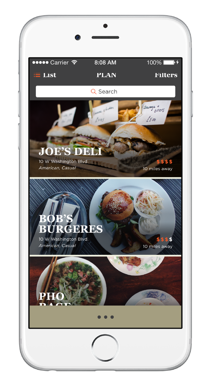
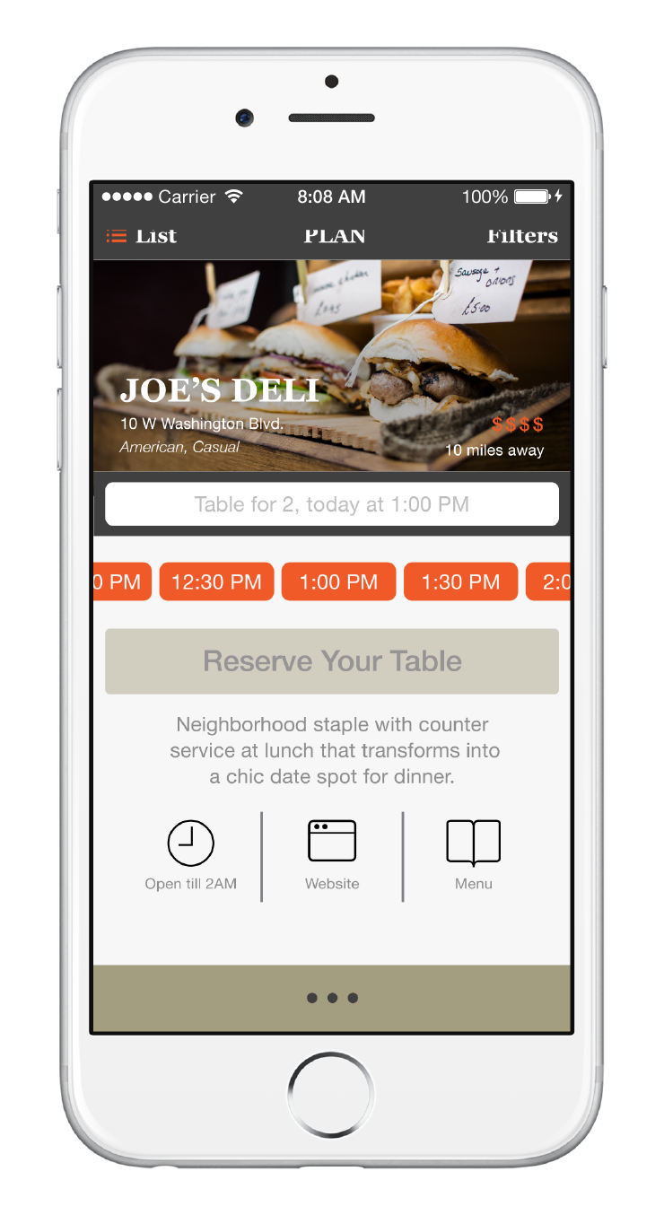
Wireframes
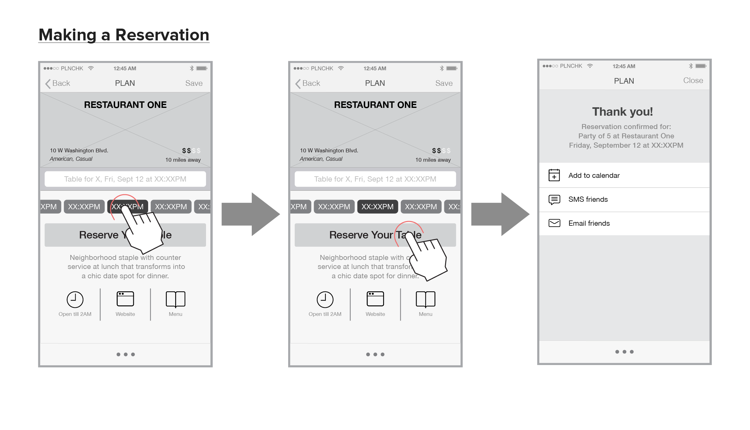
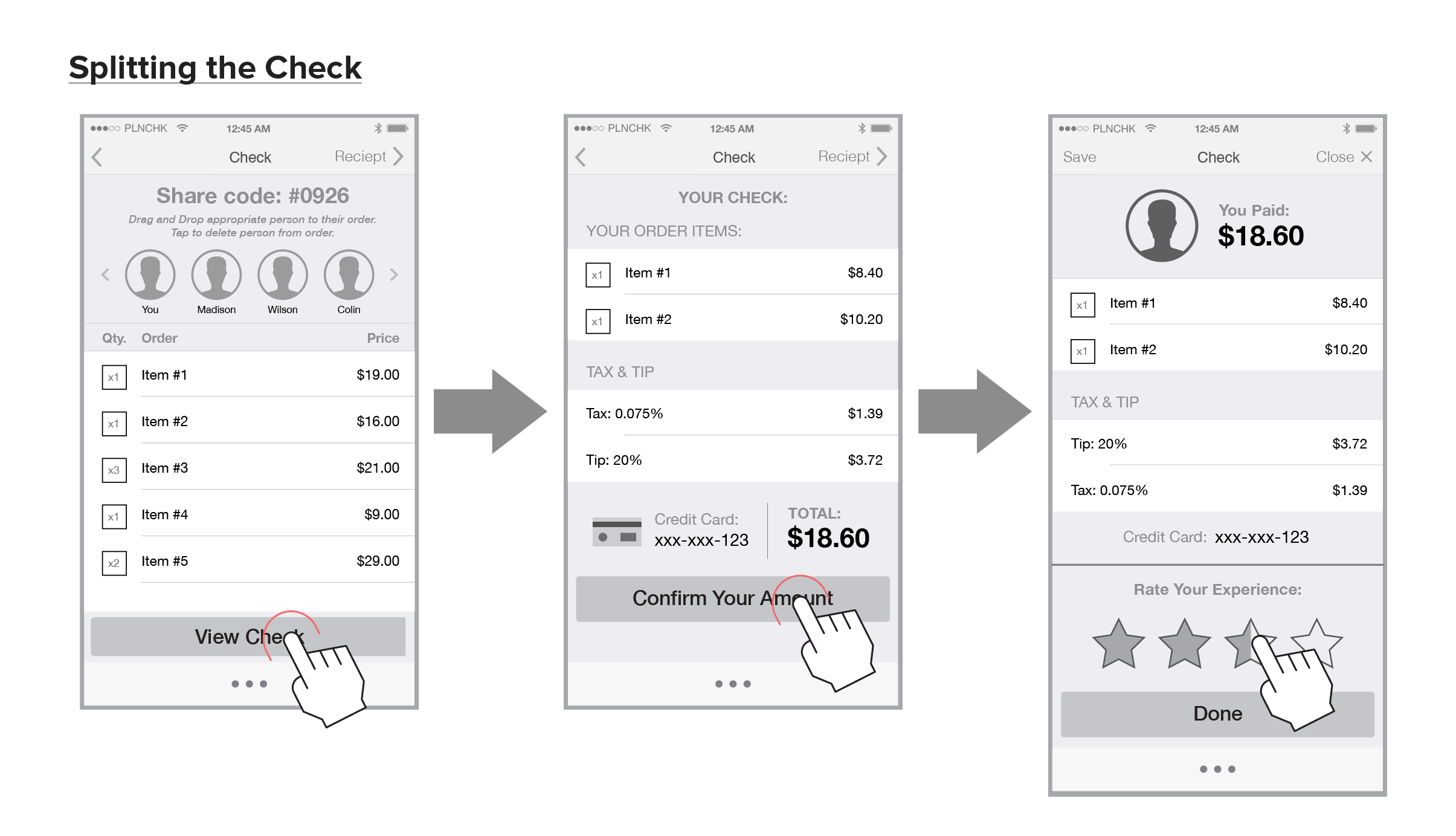
A progression of key screens from low to high fidelity wireframes.
These iterations were based on feedback received from user testing.
User Testing
We tested our wireframes against key tasks with our Axure prototype. This helped us identify user
frustrations we needed to address so we could improve our designs. Here is some feedback and observations we received from user testing:
User 1: Brock
• He went to using gestures he was familiar with (i.e. swiping) in order to start splitting check amongst other people.
• In order to move on to a next step he ignored the button at the bottom to proceed and pressed the nav bar at the top to proceed to next page/step.
• Feedback: Mentioned that after order screen he would want to know how to get back on track since he will put down his phone during the meal and might lose his place in the app; Clearer way to find navigation menu.
User 2: Kathy
• When creating her reservation she had a hard time reading the content in the reservation input field.
• If she accidentally dragged someone to the wrong item in the split item screen she wanted to drag that person from the “wrong item” to the correct one.
• She also had a hard time finding the navigation tab at the bottom and confused it a pagination pattern.
• She completely read the instructions at the top of the split screen and found splitting the items amongst her party pretty easily.
Iteration
Based on the feedback received we then went back to the drawing board to adjust key task flows accordingly.
Redesigned Dutch Split Process:
Key Learnings
• Next Steps: User test with screens relevant to secondary users (e.g. guests of the planner persona) to work out the kinks of the entire process and iterate again.
• Since this was a personal group project, my team and I lacked communication with a developer at the beginning of the project phase to really understand the integration of our application with current POS systems. This taught us the importance of working with developers at the beginning of a product cycle to fully understand the technology you are building for.
View More Projects