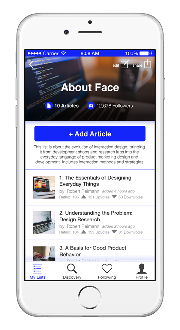
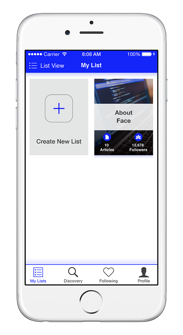
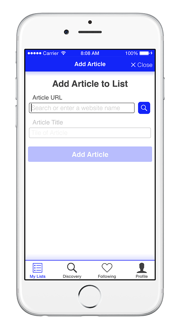
Project Overview
The Problem:
Information is easily accessible than ever and increased consumption of online content by users has rapidly been growing. With the vast amount of content being pushed out everyday how do people sift though the endless amount of content to find the great ones?
The Solution:
Array allows for people to compile the great pieces of content and share them in organized and topical “playlists.” Other users can then in turn help one another refine the organized list of content through the means of voting and contributing to the ranking of articles on these user generated lists.
My Role:
UX designer (Individual Project)
TOOLS:
Marvel (Prototype), Adobe Illustrator CC (Wireframes and Visual Design), Pen and Paper (Storyboarding)
Discovery
Value Proposition and Research
Due to the increase of mobile internet usage over the past 7 years (graph 1) and that the fact that iPhone users interact with their smartphone apps nine more hours in a given month than Android users (graph 2), this app will mainly focus it’s development for the iPhone 6 & 6s.
Array will be a tool developed as a mobile app with the integration to both mobile web browsers and other mobile apps. Not only does this app seamlessly integrate with other apps but it allows for collaboration with companies that allow for user content discovery (i.e. Flipbook, Twitter, Facebook, etc.).
Persona
Based on the research found in the discovery period of the project a persona was developed, Venessa Cameron. Designing for Venessa helped in making informed design decisions as I had the end user always in mind.
Storyboarding & Information Architecture
Keeping Venessa in mind, I story boarded the user’s behavioral flow from content discovery to topical playlist creation with Array integrated in her behavioral decision making. These flows helped in defining the necessary features required for Venessa to successfully navigate through the app.


By narrowing the features necessary for Array to function through storyboarding, I then created a site map to
organize the pages, information, and navigation of the app.
Wireframes
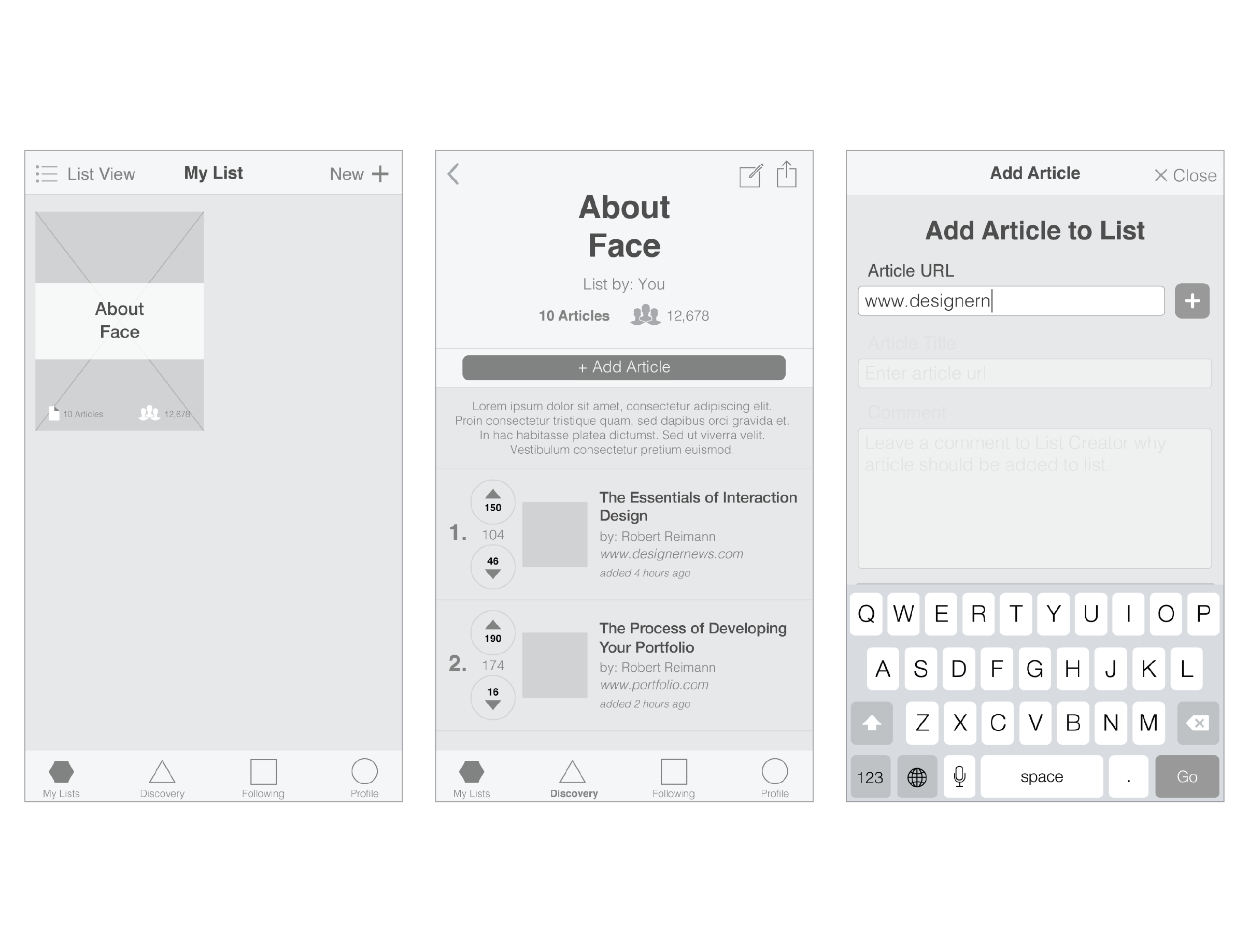
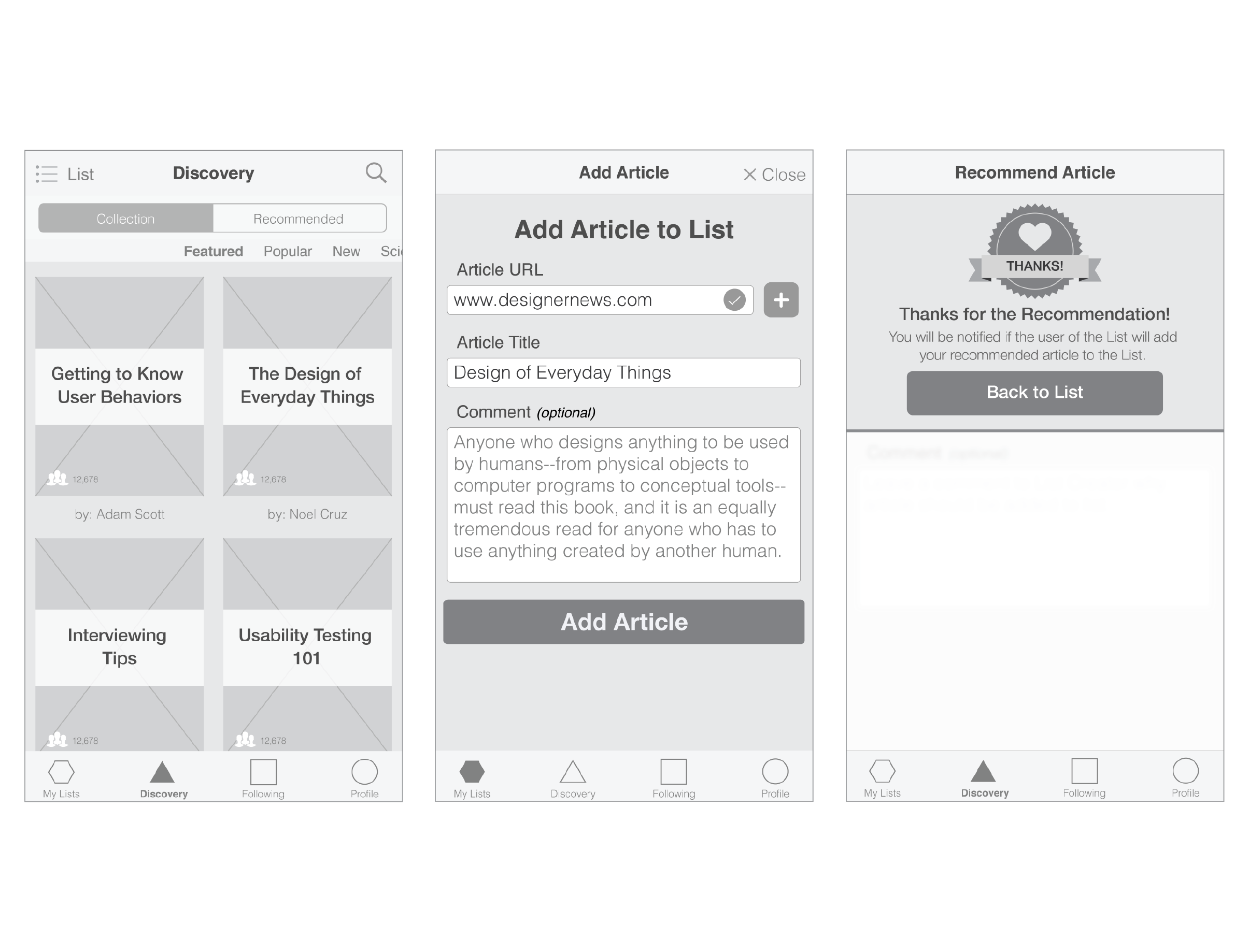
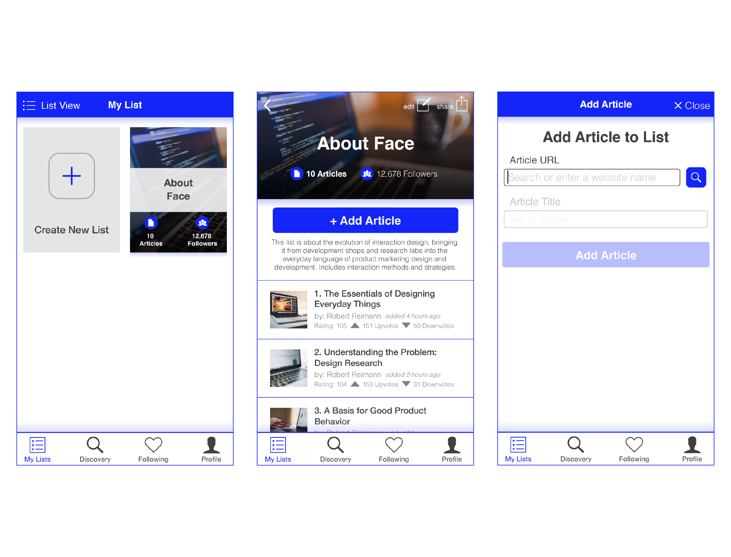

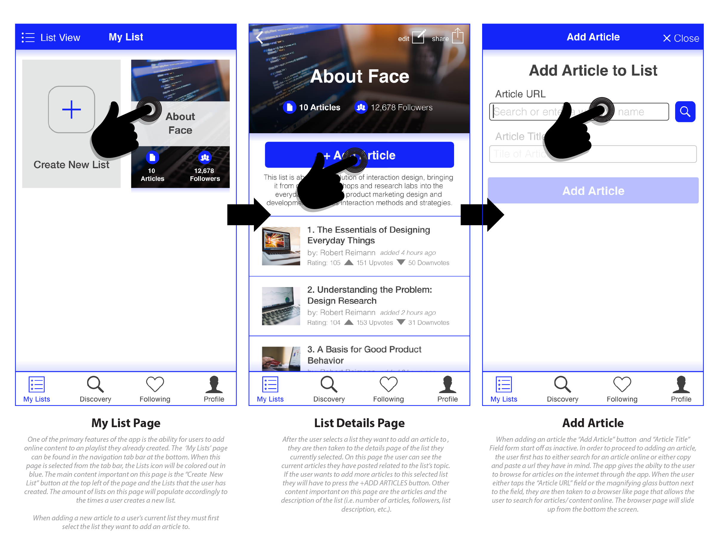

A progression of key screens from low to high fidelity wireframes with annotations. These iterations were based on feedback received from user testing the low fidelity wireframes.
User Testing
With defined high fidelity wireframes created based on feedback though the testing of lower fidelity wireframes,
a clickable prototype was then created to further test and gain more accurate feedback.
Goal + Methodology:
Goal: To successfully have the user navigate within the app to their own personal list, create a new list in their collection of lists, add an article to a list, to navigate easily to another user’s list in order to recommend articles , and to upvote an article on another user’s list.
Methodology: The usability test consisted of three users and a set of tasks written out to be followed by the user.
User Testing Tasks:
Task 1: Find a list that you have created and add an article to that list.
Task 2: Search & discover another list that is not your own. Recommend an article to that list.
Task 3: Again, search & discover a list that is not your own. Within the same list upvote an article that is in that list.
Task 4: Create your own new list.
User Testing Tasks Highlight
User completes the process of creating a new list, but the User in the beginning
wants to create the list without adding articles.
Key Learnings
Kill your darlings. Sometimes one of the bravest decisions a designer can make during a project cycle is terminating a feature that seems so innovative on a design stand point, but in the end never translates to the user understanding the feature.
Next Steps:
1. Development of an Array extension for browsers and integration in other mobile content browsing apps.
2. Design user onboarding screens to familiarize them with features within the app; option to turn on and off app feature guidance.
3. Develop analytics measurements system within the app to help inform the design refinement of Array's features that better serve users needs.

